Beautiful Baths | Three Unique Renovations Showcase What’s Trending in Bathrooms
Bathrooms are small in square footage relative to the rest of your home, but these tiny rooms can deliver a big hit to the budget. It’s important to make well-considered decisions, especially for fixed elements that are difficult to change, such as tile, cabinetry, plumbing fixtures and countertops.
Three Lynchburg-area homeowners invested in their bathrooms in the past year to create more attractive and functional spaces for daily living, and the results are three stunning and unique spaces that convey their personal styles. One bathroom is a second makeover of the space for longtime homeowners who built their house 18 years ago; another is a gut renovation by a couple who recently settled in a 1950s Cape Cod; the third is a to-the-studs renovation that mixes a traditional and midcentury vibe in a 1959 home.
Read on to learn about their design and construction processes and maybe even glean some tips for your next renovation project.
PROJECT: CAPE COD MAIN LEVEL BATHROOM’S SLEEK UPDATE
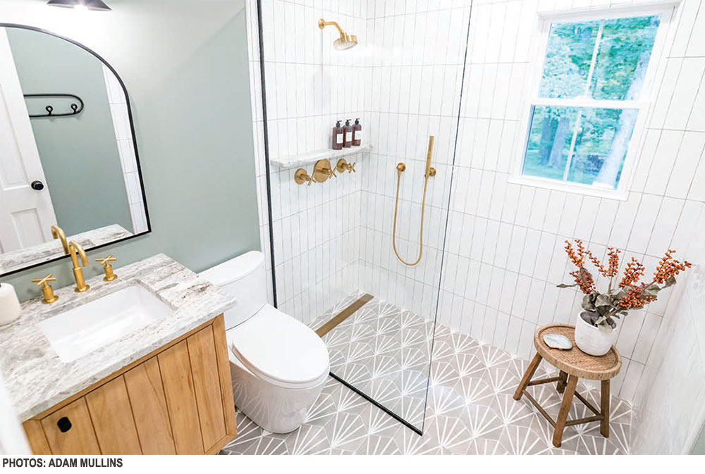
Ashley Hilbish and her husband Nathan were charmed by a classic Cape Cod in the popular Boonsboro neighborhood in 2017, but knew it needed a lot of work to make their vision come to life. “We realized the baths and the kitchen would need major work, and we decided after the kitchen to tackle the main floor bathroom first, because your knees would run into the tub,” says Ashley.
In addition to a full tub, which swallowed the 6 by 8 foot room, the space had tile covering the walls, which someone had previously painted. When Ashley attempted to clean the tile, the paint would chip off. The entire room would need to be gutted, and they decided to forgo a tub for a standup shower with a zero entry for more visual space.
“Not having that lip, that barrier to the shower makes a continuous line on the floor which opens the room and feels a bit more current,” says Ashley, who is the lead designer in her family’s business, Curtains, Blinds and Bath, helping others make choices for their home projects.
I nstead of a door, the shower has a glass panel to contain splashes while leaving a sleek entry. The shower wall tile is a 2×10-inch white subway tile with a hand-finished edge in a vertical stack, a twist on tradition. A window in the shower provides natural light, and its trim was removed so that tile would extend to the edge. A patterned porcelain tile covers the entirety of the floor, lending color and interest.
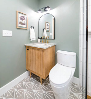 “We changed the layout of the bathroom, and we took out the linen closet for more room but added a vanity for storage instead of the pedestal sink,” Ashley says. Another addition was a fan above the shower area to cut down on humidity; code didn’t require one when the home was built.
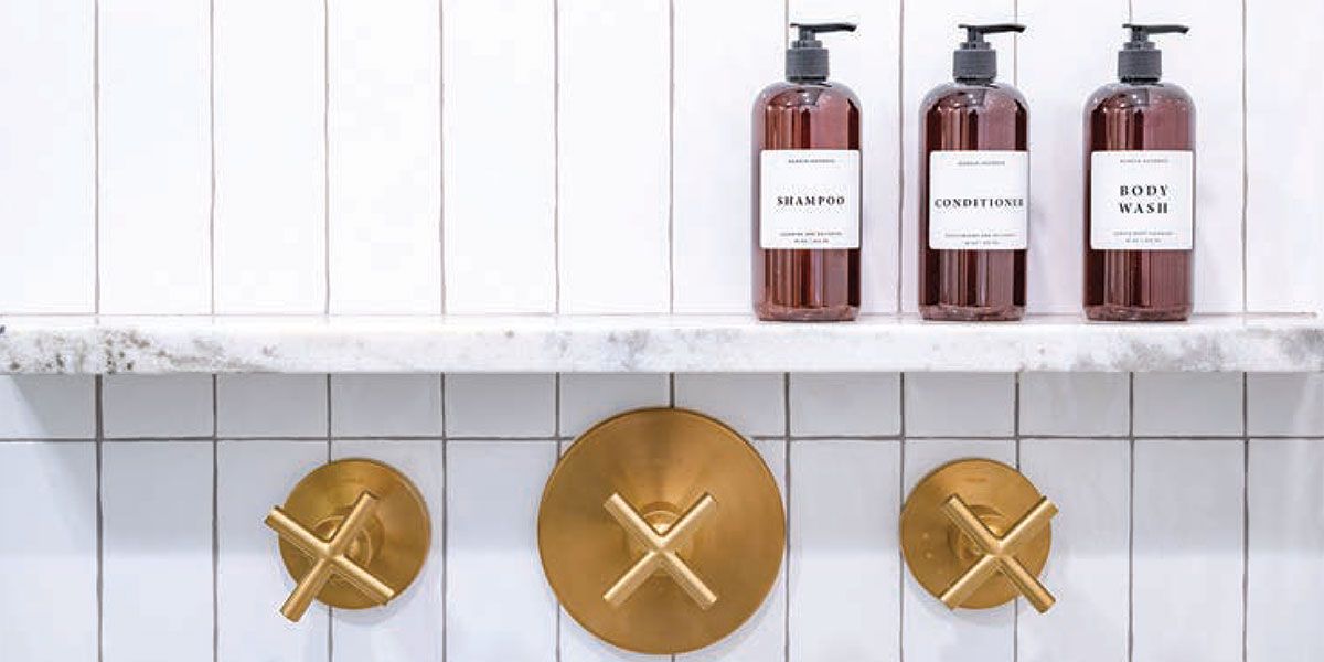
Matte brass fixtures were chosen for an updated look, and the handmade vanity lights were found on Etsy. “I tried to source things that were made in the USA as much as possible,” says Ashley.
“WE WANTED THE SPACE TO BE MORE MODERN, BUT NOT TO THE POINT IT DOESN’T MAKE SENSE FOR THE DESIGN AND CHARACTER OF THE HOUSE,” ASHLEY SAYS. “YOU WANT IT TO BE UPDATED, BUT NOT TOO TRENDY, SOMETHING THAT STILL HAS THAT CLASSIC FEEL.”
Sourcing was more difficult than usual, as COVID-19 caused shipping delays to be extended multiple times, causing Ashley to pivot on some of her initial design decisions. Tile choices were changed, and a different faucet had to be ordered.
“I wanted a wall-attached faucet for the sink, but the delays were so numerous I finally gave up on it and chose something I could get my hands on,” she says. The delays created some headaches for Ashley and her contractor, and the project took longer than expected. However, her experience in design helped her weather any challenges, and she enjoyed the process of watching the bathroom come together.
“We wanted the space to be more modern, but not to the point it doesn’t make sense for the design and character of the house,” she says. “You want it to be updated, but not too trendy, something that still has that classic feel.”
PROJECT: PRIMARY BATHROOM REFRESH WITH A VINTAGE FEEL
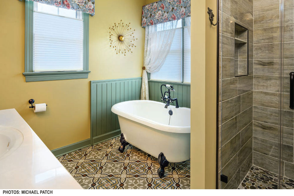
Kathy and Larry Potts built their Forest-area home in the early 2000s, and since that time have made changes as their style has evolved and the budget has allowed it. “When you are building an entire home at one time, you have to compromise on some things to stay within the overall budget,” says Kathy. The original primary bathroom had a jetted tub and one-piece shower insert. The first update Kathy did several years ago was to rip out the shower insert in favor of a tiled shower. “At that point, we kept the tub and put in a tile surround that matched the shower tile,” she notes.
Kathy had noodled around with the idea of another update when she fell in love with an Art Deco-style porcelain tile in hues of gold, blue/green and beige at Lowe’s. She had to have it, and decided at that point she’d rip out the seldom-used jetted tub in favor of a clawfoot freestanding model, and would use the tile she loved on the floor.
Kathy, who owns a local Decorating Den Interiors franchise, hired F&S Construction to execute the project, and she and her husband moved out of their en suite to a guest bedroom for the duration of construction, which began at the start of 2021.
“We were going for a vintage look in the bathroom, something that feels like a cross between farmhouse and Victorian,” Kathy says. Beadboard trim, echoing the wall treatment in the kitchen, surrounds the new freestanding tub. Valances in a rose pattern lend a softness to a room with hard surfaces, and neutral light-gold walls and a blue/ green trim pick up the colors in the tile.
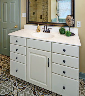 Kathy still liked the vanity and it fit the new scheme, so she kept it, but changed out the existing chrome plumbing fixtures for oil-rubbed bronze. She had also intended to leave the shower, and only clean up the grout to make it shine. But as it happens in many renovations, things didn’t go according to plan.
“WE WERE GOING FOR A VINTAGE LOOK IN THE BATHROOM, SOMETHING THAT FEELS LIKE A CROSS BETWEEN FARMHOUSE AND VICTORIAN,” KATHY SAYS.
“When the tile guy got in there to clean up the grout, he realized that water had seeped between the grout lines, so there was water damage underneath, which made sense because we were always fighting mold in there,” says Kathy. “It turns out the tile wasn’t laid correctly, so we had to rip it out and put in a new shower.”
A shower niche (a small recessed shelf) was added in the remodel, allowing a nook for shower toiletries. Pebble tile on the floor is neutral but interesting, and Kathy says it feels great underfoot. An accent strip of the floor tile runs along the back wall of the shower, and is surrounded by a neutral ceramic framing the rest of the shower walls. A new mirror over the vanity completes the refreshed space.
“I love it … when I walk in it makes me happy,” says Kathy. “To me it’s very warm and inviting.”
 PROJECT: BATHROOM RENOVATION IN 1950s HOME NODS TO ITS MIDCENTURY ROOTS
When husband and wife Paddy Fannon and Jessica McAuliffe purchased a ranch home in the Boonsboro area, they knew a primary bathroom renovation was on the to-do list. Within a year’s time they had enlisted designer Tera Janelle to rework the dated bathroom.
“The shower was dark and claustrophobic, and though the room was still going to be small we needed more functional storage,” says Paddy. “We wanted something bright and more modern, but still comfortable.”
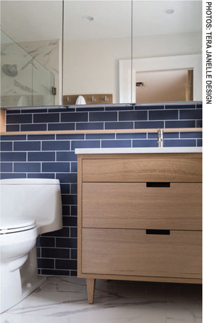
Janelle designed a bathroom that took advantage of every square inch since the footprint couldn’t be expanded. “We employed several design tricks to visibly maximize the space in this bathroom,” she says. Some of those tricks were extra-large mirrored medicine cabinets to reflect light and create a more spacious feel, and replacing the current vanity with one that is wall mounted, revealing the floor tile underneath.
AS FOR THE STYLE INSPIRATION, JANELLE SAYS PADDY AND JESSICA LIKE A MIDCENTURY LOOK BUT WERE ALSO MINDFUL OF RETAINING A TRADITIONAL FLAVOR IN KEEPING WITH THE NEIGHBORHOOD. “WE INCLUDED BOTH MIDCENTURY AND TRADITIONAL MOMENTS IN THIS BATH,” SAYS JANELLE.
“Seeing the floor tile under the vanity visually opens the space … the custom vanity allowed us to fit the width of the area precisely, providing additional storage,” says Janelle.
 The previous shower was enclosed and cavelike, and the new shower has an open design with a niche that expands the entire back wall, providing ample storage for toiletries, and is highlighted with LED lighting, lending brightness to the room.
As for the style inspiration, Janelle says Paddy and Jessica like a midcentury look but were also mindful of retaining a traditional flavor in keeping with the neighborhood. “We included both midcentury and traditional moments in this bath,” says Janelle. “The plumbing fixtures, as well as the wood tone and design of the vanity and mirrored medicine cabinets, feel decidedly midcentury, while the traditional tile selections keep things from leaning too far in one style direction or the other.”
As for tile, a 3×9-inch slate blue FireClay tile, handmade in California, is the unabashed star and runs the length of one wall, behind the vanity. It is softened by the gray-and-white-veined marble tile on the floor and the remainder of the shower walls. The blue tile had a long lead time, explains Janelle, and when it finally arrived, it was the first element to go up in the bathroom.
“During installation the client was worried about the blue,” notes Janelle. “After the other elements in the room were installed, the blue tile was one of her favorite moments in the bath.” ✦
BATHROOMS, Cape Cod, Matte Brass Fixtures, Midcentury, Mirrored Medicine Cabinets, Oil-Rubbed Bronze, Shower Niche, Standup Shower, Subway Tile, Tiled Shower, vintage
