Design Through the Decades | Home Trends that Stand the Test of Time

The saying “everything old is new again” has been around for centuries. It’s true in many contexts, among them design. Home trends come and go through the decades, so if you hang on to something long enough, it could make a comeback.
PIECES FROM DIFFERENT DECADES LEND DEPTH AND ORIGINALITY, THE ANTIDOTE TO “NEUTRAL” OR “TRANSITIONAL” SPACES. PULLING INSPIRATION FROM PREVIOUS ERAS ALLOWS YOU TO CREATE AN INVITING HOME FILLED WITH THINGS YOU LOVE THAT EXPRESS YOUR PERSONAL STYLE.
Today more than in any recent design era, the emphasis is on individuality and unique finds, handmade and repurposed over mass market. The result is the freedom to use whatever you love in unexpected ways. If you don’t have anything from a bygone era, antique and consignment shops can yield a treasure trove. Here are some trends from previous decades that we’ve noticed are making reappearances.
EARLY 20TH CENTURY
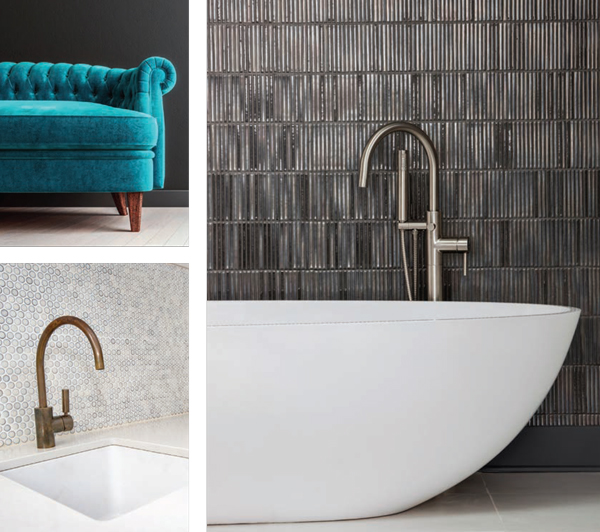
Penny tile—small circular ceramic or porcelain tile so named for being about the size of the coin—has been around for over 100 years, but has recently returned as a popular look. Once used predominantly for bathroom floors, there are many ways to use it in a modern context. In the bathroom, penny tile looks great as a shower or accent wall, especially in water-themed shades of cerulean and aqua. In the kitchen, penny tile is a fresh take on the backsplash. It’s a glam finish for everything from a wet bar to a fireplace surround. White grout with colored penny tile is both a clean and interesting aesthetic in many applications, but one word of caution: It’s a LOT of grout to clean if the area gets traffic. So for a bathroom floor, white tile and gray grout might serve you better.
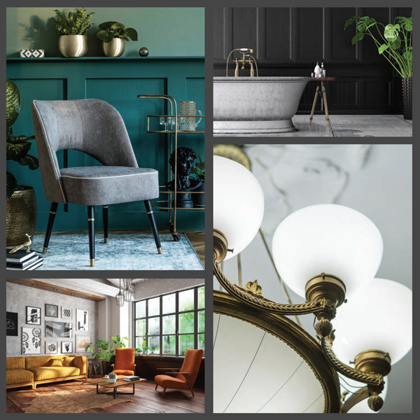
Freestanding tubs were the bath de rigueur until the advent of the built-in shower/tub combo after World War II, but in recent years they have returned once more as a symbol of luxury. Today’s freestanding tubs feature sleek curves and modern lines, often with a Japanese soaking tub aesthetic. Finishes range from white to wood to copper, and are at home in a range of decor styles, from minimalist to farmhouse.
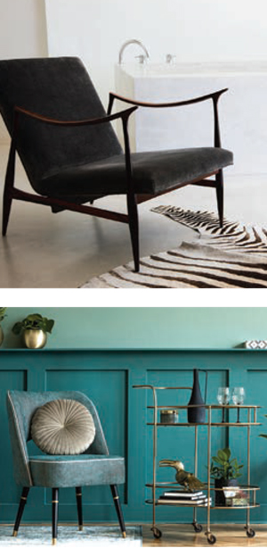
Velvet is another design trend long associated with luxury. But modern velvet furnishings have little in common with the stiff Victorian vibe of 100 years ago. Easy-to-care-for finishes and an array of vibrant colors have taken velvet out of the parlor and into the mainstream. One tip to make velvet look fresh is to use it as an accent: a side chair in an unexpected color, throw pillows on a textured sofa, a pouf, headboard or quilt. For drapes, stick to modern hardware and forgo the tassels to keep it looking current.
 1920S
1920S
The Roaring 20s ushered in the Jazz Age and Art Deco, which was known for bold geometric shapes and metallic accents that created a sleek, sophisticated aesthetic. Art Deco style is seen again now in furniture with curved lines and glossy gold or chrome trim. Paired with an exotic animal-print accent, it lends any space cosmopolitan flair and keeps it firmly grounded in the 21st century.
An angular Art Deco mirror or mirrored chandelier contrasted with modern art creates a stunning effect. Anything that speaks of luxury—lacquered finishes, leather, inlaid wood—is a reflection of the elegance of this period. On a smaller scale, glass and crystal accessories, such as champagne coupes and crystal or cut-glass decanters, add a bit of Gatsby glam.
1930S
Glamour continued into the 1930s with Hollywood Regency style, known for its lavish details. The modern iteration tones down embellishments while keeping the glitz. Furniture such as tufted sofas and headboards are emblematic of this style. The era’s oversized mirrors and mirrored furniture are chic again.
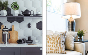 Black and white was a popular 1930s color combination that seems to be making a comeback. Black and white geometric-tiled bathrooms are on trend, and the color combo has expanded into other home areas as well. “Tuxedo” kitchens pair white upper cabinetry with black lower cabinetry. Alternatively, black and white checkered floor tile packs a design punch in the kitchen or any space.
1940S
Post-World War II design was marked by a desire for welcoming interiors. Wartime shortages meant that furnishings were short on metal, so wood finishes and making do were the order of the day. Popular elements from this era which have reemerged lately are cozy florals, ruffles, and knitted and crocheted textiles.
The 1940s also ushered in the beginning of midcentury modern design. Hairpin metal table and chair legs, born of postwar scarcity, were a minimalist departure from heavy table legs and are in style again. Plywood became popular, with Charles and Ray Eames debuting their first molded-plywood dining room chair, en vogue again in recent times.
 1950S
1950S
Midcentury modern style has been firmly ensconced in home design for a few years now, and no wonder—so much from that decade still feels fresh in contemporary homes. Airy white and neutral palettes, clean lines and minimal brica-brac are easy on the eye. In addition to the Eames Lounge and Ottoman chair (released in 1956), famous names like Eero Saarinen and Hans Wegner gave us iconic shapes such as the tulip table, the womb chair, and the wishbone chair, which are all in demand today.
Bar carts are back, that sleek, space-saving alternative to a built-in bar. They still feel chic in glass and metal, and even rattan. Use it to serve up a Manhattan or a Gin Rickey and you’ll be as hep now as a pack of Chesterfields at the sock hop.
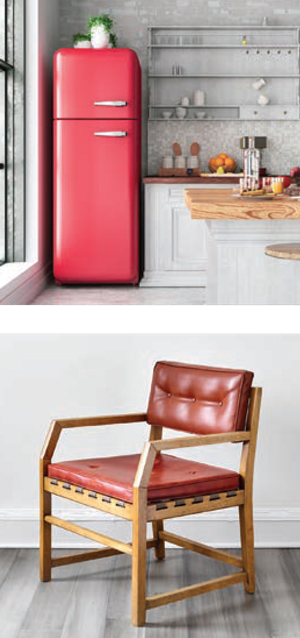
In the kitchen, retro appliance brands like SMEG and Big Chill feature 50s-era refrigerators, stoves, toasters and coffee makers in pastel, chrome-trimmed hues. They are at home in a variety of design styles, from cottage to farmhouse to bohemian.
 1960S
1960S
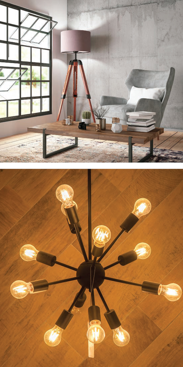
The midcentury modern movement continued into the 60s, joined by space race fervor. Atomic-inspired shapes such as Sputnik chandeliers and shiny plastic finishes are still à la mode today. A mix of natural and synthetic materials works best now as then; unless you want your home to look like The Jetsons, be sure to ground those funky boomerangs and starbursts with some furnishings featuring straight lines and organic finishes.
The late 60s evolved from mad for modern to flower power, bringing in a mix of earth tones with lively folkcraft and bohemian touches. This look is definitely still on-trend, with flokati, rya, and other long-pile rugs an easy way to evoke the era. Bold colors and mixed patterns combined with wood furnishings capture a groovy vibe without veering into full tiedye psychedelia.
 1970S
1970S
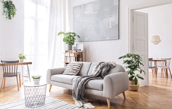
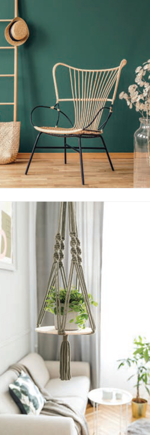
Nature was front and center in a lot of 70s design, and that look is back in a big way. Houseplants were and are all the rage—grassy spider plants, trailing philodendron, jungly monstera, and spiky snake plants offer an array of textures and bring the outdoors in, whether in floor pots or macramé holders.
Speaking of macramé, it was macramé all day then and now. Combined with rattan furnishings, it’s full of warmth and natural texture. Avocado and mustard colors are with us once more, updated as an accent rather than a wall-to-wall hue … phew!
Turntables, once relegated to your parents’ wood-paneled basement with the foosball table, are back on display and spinning vintage vinyl LPs.
 1980S
1980S
The Big 80s were loud and lavish both in fashion and home design. Memphis design (think DayGlo and squiggles), pop art, and jungle prints are all bold, colorful statements that have returned—in doses. As with avocado, these are not looks you want all over, but are perfect for a focal point or statement piece.
Eighties patterns like chintz and Southwestern also seem to be back on the scene, especially in bedding. Channel-tufted headboards with padded bed frames are another 80s reemergence, as is Lucite furniture. A Lucite side table or chair is elegant and especially useful in small spaces, where it has an almost invisible footprint.
Cesca chairs—those bouncy cantilevered chairs made from tubular steel and six-way cane—were actually designed in the 1920s but graced many an 80s dining room. Cesca and other cane chairs are having a serious moment in dining rooms, breakfast nooks, and on patios.
 1990S
1990S
Poufy curtain valances, sponge painting, silk plants and wallpaper borders might come to mind when you think of 1990s decor. A softedged reaction to the excesses of 80s decor, 90s style is best mostly left behind for now, but a few elements seem to have resurfaced, especially amongst nostalgic millennials.
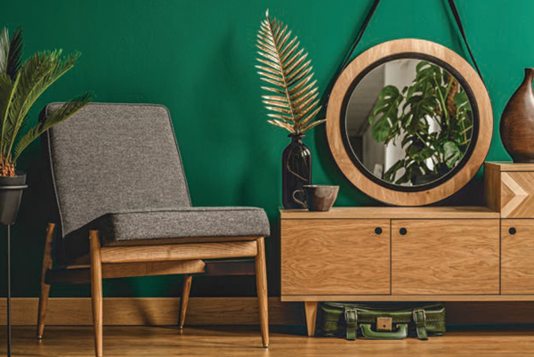
Pastels look to be returning on both furnishings and walls. Conversely, hunter green is also coming around. It’s not far removed from trés chic emerald and likewise pairs delightfully with shiny brass accents. Blue and white, a popular 90s palette, still looks fresh on a collection of ginger jars or in a bright and crisp living room.
Blonde wood can be found again in home design. It pairs beautifully with white, and is seen on open kitchen shelving, bathroom cabinetry, dining chairs and headboards, updated for the new century in sleek straight lines.
21ST CENTURY
In the past 20 years, interior design has become increasingly environmentally conscious, favoring ethically sourced, sustainable and recycled materials and furnishings.
It has also become more democratic, embracing eclecticism, global influences and personal style more than ever before. Many homeowners are seeking spaces with soul and warmth that feel collected rather than decorated.
One of the best ways to express this aesthetic is to embrace contrasts—in color, texture, shape and style. Pieces from different decades lend depth and originality, the antidote to “neutral” or “transitional” spaces. Pulling inspiration from previous eras allows you to create an inviting home filled with things you love that express your personal style. ✦
“Tuxedo” kitchens, 1920S, 1930S, 1940S, 1950S, 1960S, 1970S, 1980S, 1990S, 21ST CENTURY, Art Deco, Atomic-inspired shapes, bar carts, Blonde wood, bold geometric shapes, built-in shower/tub combo, Cesca chairs, chrome-trimmed hues, DayGlo, EARLY 20TH CENTURY, eclecticism, Features, flower power, Freestanding tubs, glam finish, grassy spider plants, Hollywood Regency style, Home Trends, Houseplants, Jazz Age, jungly monstera, lucite, macramé, midcentury modern design, Pastels, Penny tile, personal style, pop art, Post-World War II, postwar scarcity, recycled materials, Roaring 20s, spiky snake plants, Sputnik chandeliers, squiggles, trailing philodendron, Velvet
