Hot For Spring: How Will Your Home Wear Spring’s Top Colors?

 We’re lighting up at the first signs of green poking up from the ground and breathing deeply those wisps of a springtime breeze! Because no season is quite so colorful as spring, we’re breaking down some of the hottest hues of 2014 with a few simple tricks to bring each vibrant shade into your home.
Whichever shade you choose, do so with gumption and fearlessness. Using color in your home is a simple, affordable and amusing solution that happily discourages formula or finality.
FREESIA WITH CELOSIA ORANGE
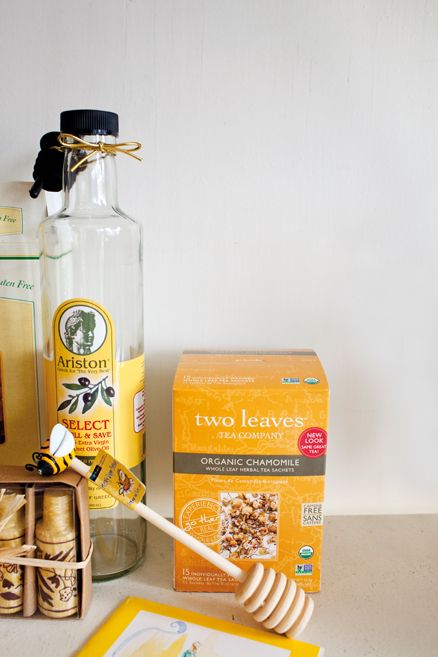
Although perhaps more often associated with summer, shades of light umber and canary yellow are already peeking out from shop windows and shelves. These optimistic colors immediately evoke feelings of joy, making them natural solutions for a springtime home refresh.
Businesslike colors such as black, grey and navy will get an attention-grabbing energy boost when paired with these sunny shades, while natural cork and wood tones will bring these colors down to earth and soften their glow.
 PLACID BLUE
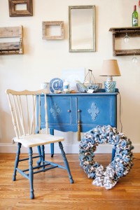
These calming colors melt easily into spring
and will travel with you into summer.
Pair these airy blues with neutrals—colors like gray, tan or a subtle combination of both. Or, a match-up with bright white brings in a celestial vibe of where clouds meet sky.
 VIOLET TULIP WITH HEMLOCK
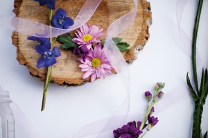
Depending on their particular depth, moody purples can come off looking warm or cool. Whether you go pastel or for a fully saturated hue, be sure to own it!
Pair your purples with mature shades ranging from gray to green. Like the stems on these wildflowers and the moss on bark, a gray-green color like hemlock keeps violet and lavender from looking like they belong in your child’s Easter basket.
RADIANT ORCHID WITH CAYENNE
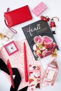
In terms of design, this mauvelous color is best taken in small doses. Bright red, adjacent to purple on the color wheel, keeps this lush lavender-undertoned shade from skewing toward something you’d find in Barbie’s dream house.
 AND PALOMA
There is such a thing as too much color. If a circus-tent effect is starting to permeate your home, try switching out brighter accents with flattering shades of grey, silver, tan and gold. Balancing bold colors with neutrals is always a great idea, especially if your “new neutral” is a metallic!
Bright Paint, Mixed Spring Colors, Sping colored decorations, Spring Decor


