Kitchen Confidential | Four Fantastic Renovations
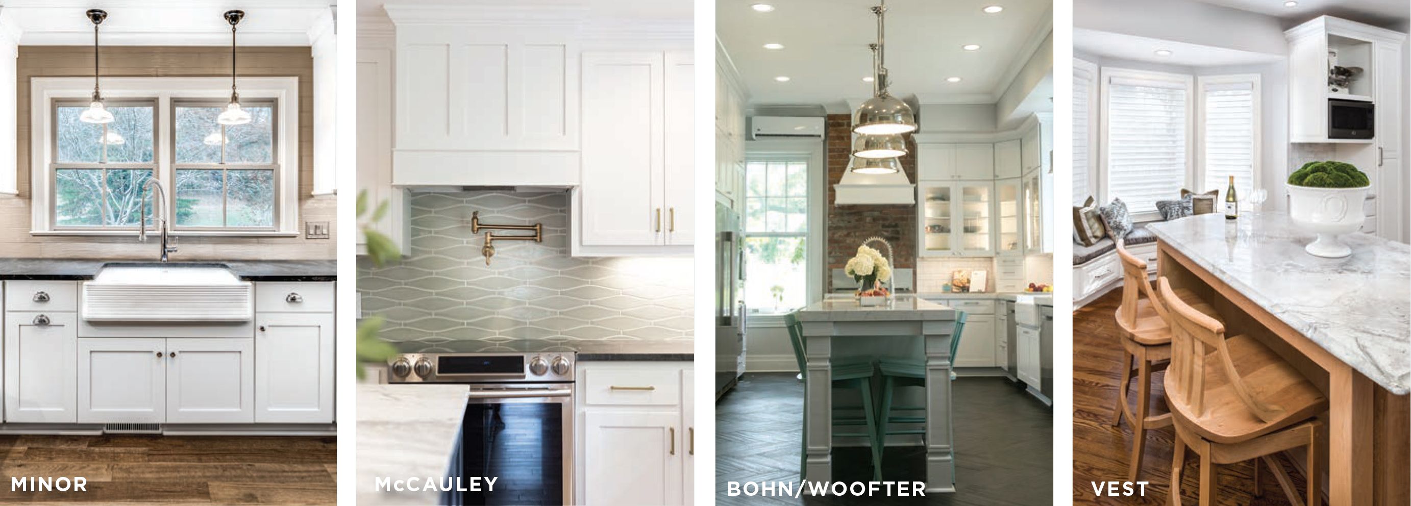

The kitchen is the heart of the modern home, and what constitutes the “perfect” kitchen is highly individual. A person or couple often purchases a house with plans to renovate the kitchen to better suit those individual needs, but the project can be long, expensive and stressful. Four local homeowners were up to the renovation challenge, and partnered with designers and contractors who made the projects as streamlined as possible. They’ve given us tours of their new and improved spaces and filled us in on the path from initial design concept to completion, sharing their best advice for kitchen renovation bliss. The new spaces vary in size and style, from a new kitchen in a historic farmhouse, to a modern update of a 1960s rancher, to a light-filled, fully-custom upgrade, to a grand kitchen in a 1907 manor in the heart of Lynchburg.
Barbara and Mike Minor: Modern kitchen with timeless style for historic farmhouse
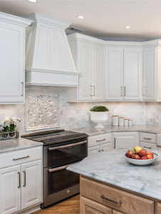
Barbara and Mike Minor have lived in their 1890s Virginia style farmhouse, surrounded by 120 acres, for more than 25 years. They’ve painstakingly renovated with an eye towards preserving the house’s character and, after a kitchen facelift in the 1990s, were ready for a full-scale renovation.
“We had two motivations for the kitchen redo,” says Barbara. “One is that it’s been a long time and was overdue, and the other was that we didn’t want to wait until the appliances started breaking and the project became an emergency.” Echoes her husband, Mike, “We wanted to be proactive in our design and decisions, and be able to make a budget and manage it.” The Minors, both retired engineers, are practical people and were looking for a designer who was equally focused on excellent functionality. Enter designer Chris Hargis.
Hargis, of Pinnacle Cabinetry and Design, understood the couple’s desire to stay within the existing layout and maximize functionality. “The Minors didn’t want to add on to the home, they didn’t want to open into the dining room… the home was not meant to be laid out that way,” says Hargis, who helped them choose a frameless semi-custom cabinet to maximize storage and usability (A frameless cabinet gives full access to the cabinet box by eliminating the interior frame.) The countertop is honed Virginia Mist granite with a leathered finish, and the tongue and groove ceiling is “a nice architectural feature that really makes the ceiling pop,” notes Hargis.
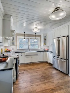 The Minors wanted a place for everything and everything in its place, so their wish list included concealing the microwave and an appliance garage to hide the smaller appliances. “I wanted a clean look without things on the counters,” says Barbara, who enjoys cooking with Mike. They prepare a lot of fish dishes, so a big, capable range hood to handle odors was another item on the “must” list. The Minors also wanted a larger fridge, and a relocated dishwasher that would not interfere when both of them were working at the kitchen counter. Period-appropriate light fixtures and a generous farmhouse sink tie in the look, while dedicated baking pan storage, custom turnstiles in corner cabinets, an under-counter trash can and a pullout drawer for heavy appliances (like a blender and stand mixer) satisfies the couple’s need for improved functionality.
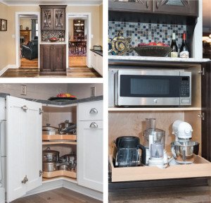 A custom cherry hutch offers a pleasing contrast with the kitchen’s white Shaker-style cabinets. The hutch has a quartz top, which is echoed in the piece of quartz behind the stove. Its decorative glass upper doors display stemware and other treasures, and it has closed storage
beneath for utilitarian items. What would the Minors do differently in the kitchen, now that the renovation is complete? “ I would have done it much, much sooner,” laughs Barbara.
STEAL THESE TIPS: Consider the style of the rest of the house when designing a new kitchen. The Minors’ kitchen has modern conveniences, but looks like it belongs in their historic home because of savvy cabinet, counter and lighting selections. You can drastically improve functionality without knocking out walls, and you can save money by sticking within the footprint.
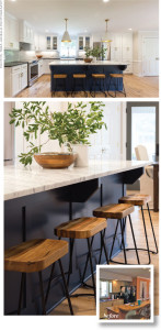 Meredith and Travis McCauley: 1960s rancher gets classic kitchen with a twist
Just over a year ago, Meredith and husband Travis were house hunting—and while they entertained newer builds, they ultimately settled on an older house in Forest. “A lot of new builds are pretty, but I wanted to put my own touch on things,” explains Meredith. “So we went with an older home that needed some love.”
They got right to plans for a renovation, and found designer Tera Janelle while looking at online portfolios of Lynchburg designers. “I really liked her aesthetic, which is clean,” says Meredith. Janelle designed the kitchen and guided the couple with materials selection. According to Janelle, the original kitchen felt smaller, choppy and closed off from the rest of the house. This problem was addressed by widening the opening between the kitchen and living room so that it felt more connected. Getting rid of the popcorn textured ceiling and awkward soffits that made the kitchen feel closed in also helped visually enlarge the space. New white-washed oak flooring throughout the home replaced mismatched flooring and created a more seamless transition from room to room.
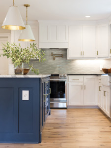 Custom white Shaker-style cabinets make the kitchen light and bright, and the former two-tiered island was swapped out for a much larger, flat kitchen island whose base is painted a contrasting blue shade, so it really stands out against the white. “This is a fresh bent on the classic white kitchen,” says Janelle. “We put a bit of a spin on it by incorporating color and bringing in things that have a lot of inherent character.”
Color and character come not only from the blue island, but also from the handmade, grayish-green backsplash tiles, which lend interest and texture. The white lower cabinets are topped in a dark gray granite with a matte, leathered finish that mimics soapstone. The island countertop is marble, and Janelle says 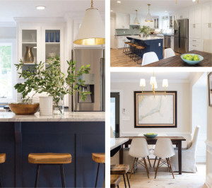 they hunted for the perfect slab with interesting veining. The brass accents feel fresh, from the pot filler behind the stove (a must on Meredith’s wish list) to the cabinet hardware and lighting. Stunning Circa Lighting fixtures punctuate the space, from the library-style fixture over the sink, to the dining table chandelier, to the show-stopping white island pendants which reveal brass on the inside. Meredith wasn’t sure about the island light fixtures at first, and they were outside the original budget, but now they are one of the couple’s favorite aspects of the kitchen.
“It’s just exactly what we wanted,” says Meredith, who has enjoyed entertaining at home since the kitchen’s completion this past summer. “We can gather in the kitchen and around the island now without feeling like we are on top of each other. We love it.”
STEAL THESE TIPS: Janelle says that most paint brands have a historic color collection, so if you are looking to add in some color but want something timeless on hard-to-change elements in the kitchen, these colors can guide you. In Meredith and Travis’ kitchen, the island color is Benjamin Moore Washington Blue, a classic shade that shouldn’t look dated in ten years. And, statement lighting is like jewelry— it provides the “wow” that ties everything together.
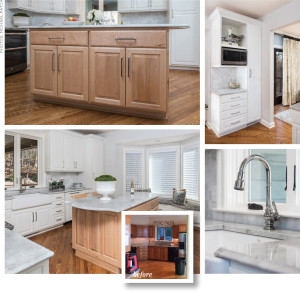 Nancy and Andy Vest: Fully custom upgrade turns dark kitchen into light oasis
Andy and Nancy Vest have lived in their home for more than 20 years, and it suits them well. Situated on a private, sevenacre wooded lot, it’s a tranquil spot for the couple. But the kitchen was anything but tranquil—dark, dated and cramped, it wasn’t a place the Vests wanted to linger.
“Everything was big and clunky and dated,” says Nancy. “The house sits in the woods so we don’t get a lot of natural sunlight, and then the dark cabinets… and we had a table and chairs but the space really wasn’t big enough, so everyone would jockey for one chair that was at the most comfortable spot.”
Designer Moyanne Harding had worked with the couple over several years on different projects in the home, and the Vests trusted her to guide them through the kitchen renovation. On Nancy’s wish list was better lighting, as it was sorely needed for kitchen tasks and for working at home. (An accountant, Nancy often works at night in the kitchen.) She also loved Bird’s Eye maple, a more exotic wood grain that isn’t often used, and she wanted to incorporate it in some way into the kitchen.
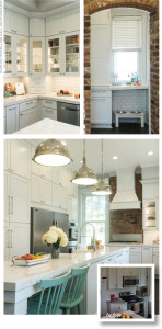
Harding ran with the Vests requests, and created a kitchen that is light, bright and more functional. She relocated appliances like the refrigerator for better function. The table and chairs were out and a new island with seating for two was added, with room for more stools in a pinch. The island is Nancy’s favorite Bird’s Eye maple, which stands out from the rest of the white cabinetry. The cabinets are fully custom, and cabinet panels cover the dishwasher and refrigerator for a clean look. A marble countertop adds to the room’s brightness. “To get more light, we added bigger, taller windows and opened up the walkway into the kitchen,” says Harding. “We added a window seat at the bay window, and were able to create more storage in the island. The result was a functional, comfortable kitchen.”
One of the cabinets hides a roll-out dog food container for the Vests’ beloved German Shepherd, and Harding carved out a special spot in the kitchen for his food bowls. The island has a place for Nancy to plug in her calculator when she sits in the kitchen at night, finishing the day’s work. No detail was left to chance, and Nancy is tickled pink.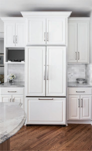
“There are so many lights in the ceiling now, I could dissect something on the island if I wanted to,” Nancy says with a laugh. “When I walk in the kitchen, it’s bright and happy and I just go ‘ahh’… it’s cheery, but it’s also a peaceful spot. It came out better than I could have expected.”
STEAL THESE TIPS: If there is a material that you’ve got your heart set on in the kitchen, don’t let anyone talk you out of it. Find a designer who supports you, like Harding did with Nancy’s Bird’s Eye maple request. And be open to change—even though you’ve had an appliance in one location, consider moving it if the suggestion is made and is backed by sound reasoning. Harding moved elements in the Vests’ kitchen, and though Nancy was initially resistant, she’s happy she made the changes.
Jennifer Woofter and Bill Bohn: A grand kitchen for a historic home
Bill and Jennifer moved to Lynchburg from the DC suburbs, and found a majestic turn-of-the-century home on Rivermont Avenue in the heart of town. Despite its central location, the house known as Seven Hills Manor sits on one-and-a-half acres, complete with stables and room for farm animals. The couple were wowed by the ample space, the opportunity for a mini-farm, and the beautiful architecture, with arched doorways and details that only a historic home can offer. The kitchen, however, was tiny and cramped, and needed a renovation to suit the Bohns’ family life.
Jennifer, who loves to cook and often hosts twenty or more family members for holidays, had a wish list that included better lighting, two sinks and double dishwashers. “I constantly have one dishwasher going and one ready to load, which gets rid of dishes in the sink,” she says. “We had two dishwashers in a beach rental, and I scoffed at first, but by the end of the week I loved it.”
At a neighbor’s recommendation, the couple turned to designer Sarah Girten for a plan. Together, they decided to take out the wall between the kitchen and one of the home’s two dining rooms. When the walls were opened up, they found a brick archway (now leading into a new mudroom) and an exposed brick wall, which was retained behind the new stove.
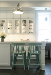
When demolition was done, Girten had a 14-foot by 25-foot long rectangular room with tall ceilings to work with, and filled it with white cabinetry, including a wall of glass-fronted cabinets to break up the run of white. The upper cabinets are 42 inches tall, to better fill the space. A 13-and-a-half-foot long island takes center stage, with seating for four at one end— two chairs facing two, like a traditional table. The countertops are quartz made to look like marble, as Bill and Jennifer love the look of natural stone but shied away from the maintenance. “We made the countertops more than double the normal thickness, because the size of the kitchen and the soaring ceilings would have made the standard one-inch counters disappear,” notes Girten.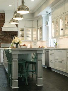
The backsplash is beveled white subway tile with gray grout, while the floors are a wood-look tile in a chevron pattern with a radiant heat system installed underneath to better warm the space on a cold day, as it is one of the chillier rooms in the house. Explains Girten of the flooring, “We didn’t want to try to match the hardwood in the house, which was a skinny hardwood from the early 1900s, so we decided to go a different direction entirely so it didn’t look like we tried to match and failed.”
The Bohns and Girten turned to Charlie Morris, of Morris Construction, to bring the plans to fruition, and Morris had some ideas of his own, including a custom-made, quartz-topped holder for dog food bowls, for the Bohns’ four-legged family member. Says Morris of the entire project, “Renovating an older home brings more challenges, but it’s often more enjoyable. You have a chance to fine tune your craft, and you lean more into making everything just right, even if it requires extra time.” Adds Girten, “The result is a crisp, clean and beautiful white kitchen.”
 STEAL THESE TIPS: Don’t count out the big box stores for cabinets—they often run specials that can provide a boost to your budget. The Bohns got an excellent deal on cabinetry which allowed them to splurge in other areas. And, if you have a large family or entertain a lot—think about two dishwashers for ease of cleanup.
Four distinct kitchens in four different kinds of houses—but each homeowner says the renovations have drastically improved the way they live in their space. The big takeaway? Know what you want out of a kitchen renovation if you think one is on the horizon. Keep a wish list going, so you can determine later what you can compromise on for the sake of budget, and what is a “must” for your situation. If you feel antsy about making big money decisions on your own, consider a designer who can guide you along in the process to make your kitchen dreams a reality.


