Light and Bright | Marrying Old and New in a Tudor Redo

Photography by Michael Patch
Suzanne and Steve Johnson met John Wingfield and Penn Burton more than thirty years ago, on a project they took on at the couple’s former home on Colonial Court in Boonsboro. Like their new house, the former home was an aging beauty in need of a makeover, with a dirt crawlspace that flooded muddy water every time it rained.
“We were kids,” Wingfield reflected, “just starting out.” Nonetheless, the Johnsons trusted Wingfield and Burton with the crawlspace remodel and brought them in subsequently for kitchen and sunroom additions, upstairs bath makeovers and a brand new covered porch. “For the first time,” says Wingfield, “we discovered that we could create new construction that looked like it had always been there.” With that, Wingfield & Burton found their greatest gift: the ability to “marry” old and new in restoration and new construction projects for Lynchburg’s stateliest homes from the pre-World War II era.
With that project, the Johnsons found their go-to renovation team. Going forward, the couple would not purchase a property unless Wingfield & Burton gave it a once-over.
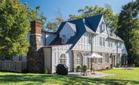
Designed in the 1920s to sit prettily atop a hill, with its lush backdrop of sweeping mountain views, the classic Tudor was designed by Lynchburg architect Aubrey Chesterman.
Faded beauty
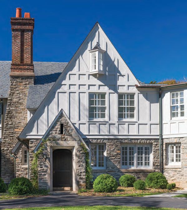
When they contemplated purchase of their current home, a gracious but faded beauty hiding behind enormous stands of decades-old, overgrown English boxwood near Virginia Episcopal School, Wingfield and Burton were called early on. Designed in the 1920s to sit prettily atop a hill, with its lush backdrop of sweeping mountain views and year-round sunsets, the classic Tudor was designed by Lynchburg architect Aubrey Chesterman of Frye and Chesterman; that firm also designed local landmarks including Kriselea (Villa Maria), the Aviary and the Academy of Music.
At his first visit, Wingfield’s initial advice to the Johnsons was to pass on the property. As he warned them, “You’re going to be rebuilding it from the inside out.”
Nonetheless, the Johnsons loved the house. They bought it in June of 2017 and hired Wingfield & Burton to undertake the enormous renovation. Mrs. Johnson found drawings at Jones Memorial Library for an addition filed in 1961. With those plans and the original drawings, Wingfield drew up architectural plans for the massive update.
In Wingfield & Burton’s partnership, Wingfield takes on the role of visionary: “I’m the creative one and I love to draw; I see in 3-D,” he says. His drawings are gallery-worthy, with multiple and detailed versions, elevations and variations in decoration and accents.
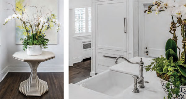
Suzanne Johnson had her own vision for the house. A visit to Hidell Brooks Gallery in Charlotte inspired the overarching theme for the house: every surface would be the brightest white she could find. “The gallery was painted in Benjamin Moore Super White,” she explains. “I decided to create the purest, whitest backdrop for my art, because it’s so bright and happy.”
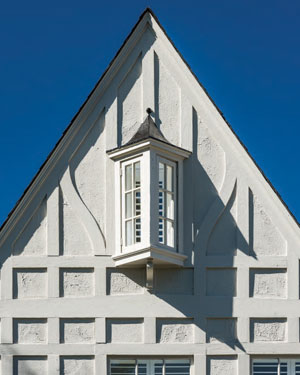
Designer Heidi Baldwin encouraged the johnsons to paint the exterior of the house all one color, foregoing the traditional tudor styling of contrasting wooden accents.
Rebuilding inside and out
Once they all agreed on a vision for the house, the team got down to “the real nitty-gritty,” as Wingfield described it. The task list to revive this home was long and daunting. “All the plumbing had to come out. Throughout the house, all the water lines, all the pipes, were ruined,” he said. The original galvanized steel pipe was completely rusted. Most of the heating pipes, buried beneath concrete floors, were corroded as well. “We had to find a way to get heat to the beautiful, period radiators, which Suzanne wanted to keep,” Wingfield added.
 There were numerous issues with plaster and studs. “Back in the old days,” Wingfield explained, “Everything was plaster. It didn’t matter if one stud bowed out like this and one bowed in like that.” He explained that builders of that era could straighten walls out with ever-forgiving plaster and it would look fine. Modern plasterboard and drywall technologies, however, require uniformity and precision in stud placement. Wingfield and Burton had to straighten all the walls in the house, a gargantuan task.
The original kitchen was small and not functional for the Johnson family’s lifestyle. Suzanne and her design team imagined a wide-open, bright-white kitchen and living area that would span the house from front to back, but Wingfield and Burton discovered that, in an earlier kitchen renovation, a lode-bearing wall had been removed, resulting in a nearly three-inch sag throughout the house. As Wingfield recalls, “We had to come in with a steel beam that would, literally, lift the whole house three inches.” A steel I-beam, the length of the kitchen, arrived on a long trailer and its installation was an engineering feat in itself.
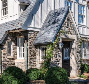
Steve and Suzanne Johnson love their “new” home: “I feel like I’m living in an English Village,” says Suzanne.
There is only one bathroom in the house they didn’t touch. “We added two and a half bathrooms where there never were bathrooms before,” added Mrs. Johnson. The third floor was finished with overhead heating and air units, as was the room above the garage, which connects to the master bedroom and became Dr. Johnson’s office.
“We knew heating upgrades would be a challenge: the original parquet floors were like dominos; they kept coming unglued because of moisture in the crawlspace,” said Wingfield. Their team eliminated moisture by insulating the space with six inches of spray foam, blocking water from breaching the crawlspace.
While they were at it, the couple had their team add ductwork throughout the house; all spaces in the house are fitted with redundant heat and air conditioning sources supplemental to the boiler.
There were other challenges, not the least of which was wiring. As Wingfield explains, “Knob and tube wiring is as safe as can be. Two wires that never touch each other—one neutral and one hot—run in parallel throughout the house. We were cutting wires left and right,” he recalled, as they figured out how to preserve and upgrade the current wiring, to meet modern home demands and be forever functional.
The job went on for months as the renovation team painstakingly retrofitted and restored the nearly 4000-square foot house.
 Out of hiding
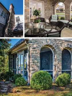
The Johnsons turned their attention to the property’s exteriors, where a cleanup was well in order. They called on landscape specialist Don Lee, whose team tended to the removal of dead and dying trees, as well as an extensive border hedge. Boxwood blight had begun to invade the street and Lee told them the allee of huge, mature boxwood lining the drive had to go. “He told me we could do it now or do it later, but we were certainly going to lose them. We took them out a few at a time to avoid the shock,” Suzanne recounted. However sad it was to say goodbye to those beautiful bushes, the effect was dramatic, as the reclusive Tudor saw daylight and took center stage for the first time in decades.
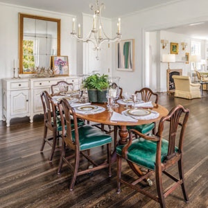
Open and airy, clean and bright: Fabulous flow for entertaining and daily life.
Designer Heidi Baldwin encouraged the Johnsons to paint the exterior of the house all one color, foregoing the traditional Tudor styling of contrasting wooden accents. “I wanted to match perfectly the stone and grout, to make the exterior look uniform and not like a checkerboard,” Suzanne laughs. “I must have spent $100 on five-dollar paint samples. I had dozens of swatches on the back of the house, labeled with black magic marker.” Baldwin was encouraging and supportive throughout the process. When the house was finally painted, the family was out of town; upon arrival home, as she recalls, “I nearly had a heart attack. But now I love it. As the old song goes, I’ve grown accustomed to her face,” she chuckled, referring to the ballad from Lerner and Loewe’s “My Fair Lady.”
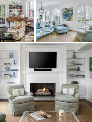
Bright white walls set off the Johnsons’ expansive art collection to perfection.
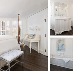 Light, bright and white
When the time came to make final choices about interior finishes, Suzanne recalled her experience of Hidell Brooks Gallery in Charlotte. She set off to find the cleanest, brightest white on the market, to set off most dramatically her immense and spectacular art collection. The construction team found that her first idea of pure white —paint with no pigment at all—wouldn’t cover the walls. It was fine for spraypainting of cabinetry but didn’t cut it as they applied color to walls. She persisted and with color consultants at Benjamin Moore, they settled on a super-white shade with just a hint of pigment. They called this new shade “Suzanne Johnson White,” and it did the trick.
“Suzanne Johnson White” covers every wall in the house. The result is a beautiful, clean, bright palette for her astounding collection of art. She has work by sculptor Virginia Scotchie and a number of large pieces by local artist Annie Massie. Also displayed are works by Frankie Slaughter, Isabel Abbott Baldwin, Sarah Yoder and Sallie Benedict.
For countertops, Suzanne visited Triton Stone in Richmond and Spectrum Stone in Concord. Kim Mays at Spectrum guided Suzanne to a pure white stone called phassos marble, quarried in Greece. As Mays remembered it, “Suzanne knew what she wanted when she walked in the door. She looked at dozens of white stones, but settled on phassos, the whitest of the whites. She is such a wonderful person and working with her was a delight.”
Flipping the switch
“In retrospect, given all we did to that home, we would have refused the job if it hadn’t have been for Suzanne and Steve,” Wingfield reflects. “I knew it would take forever. I knew there would be days where she would have to steel herself even to come to the site. Sometimes we’d work all day long and you couldn’t see what we’d done. She trusted that we were doing the right thing, slogging through the electrical, the plumbing. She showed up every day that we did, believing we would eventually get it done.”
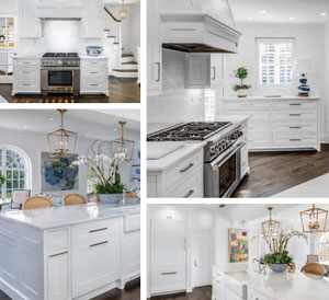
Bright white custom cabinetry unifies the open plan kitchen and great room.
Suzanne Johnson was cool, patient and ever-present. In retrospect, John realizes that she was the perfect person to lead the charge of bringing this beauty to new life. With the heart and eye of an artist and her amazing attention to detail, design and function, Johnson worked as hard as any of her team to make the renovation successful. As he noted, “Suzanne Johnson makes sure every detail is as perfect as she can get it.”
Wingfield says the key to success in a project like this one is to think everything through before walls are covered up. Planning is crucial. As he says, “We are truly and finally finished. The concrete floor is poured, a new garage is installed. Penn and I are both very proud of this house,” he says with a smile.
Steve and Suzanne Johnson love their “new” home: “I feel like I’m living in an English Village,” says Suzanne. Our neighbors are so friendly and the street is charming.” Steve adds, “It feels pastoral and bucolic.” Suzanne adds, “I love the architecture and the old-world quality of the house. It’s a work of art.”
This work of art was worth the work. The Johnsons are happy to be, finally, home. ✦
air units, Boxwood Blight, brightest white, contrasting wooden accents, overhead heating, plaster, Rebuilding, Renovation, Showcase Home, studs, Tudor, tudor styling


