Midcentury Revival | Bringing New Life to a 1950s Home
Photography by Michael Patch
In a quiet, traditional neighborhood is a house that stands out for all the right reasons. As the story goes, J. Everette Fauber Jr designed this midcentury modern ranch in 1948 and it’s believed to be the first of its kind in the Boonsboro area. Two years ago, Amy and Jimmy Davis decided to take on renovating this house and restoring it to its original midcentury style. Bedrooms were added, walls were taken down, and new life was given to this unique house.
With three kids out of college and only one high schooler left at home, Amy and Jimmy came to the decision that they no longer needed their large, traditional, historic house. “We were ready for something different,” says Amy. She says they no longer needed all of the space in their previous home and were ready to “go all in” with a new adventure. This meant that they sold just about everything out of their former house; artwork, furniture and accessories were cleared out to start over. It helps that Amy, who was a studio art major at Sweet Briar College, also has an interior design degree. Jimmy is the marketing director for Bank of the James and also has an eye for design. With their talents combined, they set out to make a fresh start
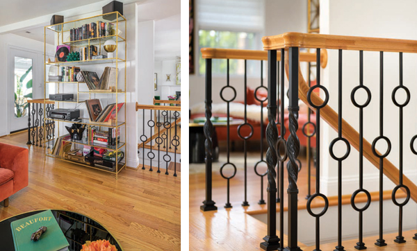
 Once finding the house that spoke to them, Amy and Jimmy asked John Vincent of John S. Vincent Custom Building to be their contractor. They brought him to the house and showed him around, bouncing ideas off of him. Amy says, “He immediately saw my vision. It was a great partnership.” Right off the bat, they knew they wanted to open up as many walls as they could and move a set of stairs to the middle of the house that leads to a small basement. Over the course of a year and a half, they added a bedroom and bathroom to the front of the house, and a master suite off the back of the house. They also remodeled the original master suite for their son’s use. This allows the family to do all of their living on the main floor of the house. Amy jokes that all of the changes were essentially “building a new house around an old one.”
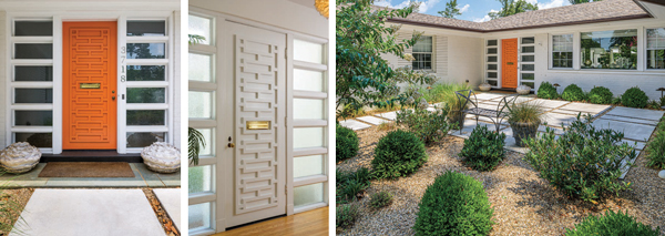
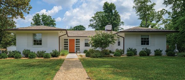
Right off the bat, walking into the Davis house, guests are met with a traditional midcentury front door. Originally Amy tried to source a door similar to one she had seen in a magazine, but she soon found that the price was exorbitant. Instead of a new door, Amy asked Vincent to add fretwork to the original door. Vincent added the detail to the back of the door as well. All original door hardware, the mail slot, and the glass blocks on either side of the door were left in place. Amy says the glass blocks were “something that really drew me to the house” and they needed to stay intact. A front courtyard garden was also added with clean, linear concrete pavers to mimic the glass blocks. The once-overgrown garden was tamed with new landscaping that features boxwood and laurel. Two solid copper obelisks that came from a downtown church made the move with the Davises from their prior home. They now flank the front garden.
 The foyer is flooded with light and all of the interior walls are painted white to further brighten the space. Wallpaper pops up in accents around the house, which Amy sourced from James T. Davis Paint and Design Center. Many of the doorways were raised to give the ranch a greater sense of height. All of the hardwood flooring which was original to the house was refinished, and the floors in the additions were matched to these. Such touches make the house feel cohesive and connected.
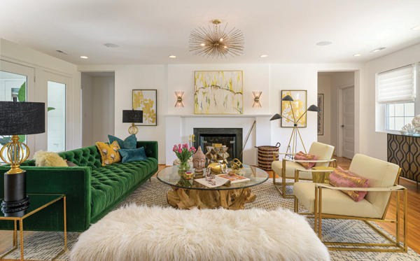
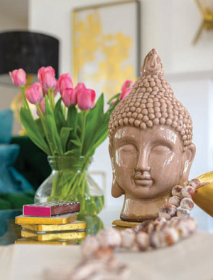
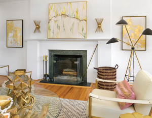 The living room is the largest space on the main floor. In this room, windows line both the front and back walls, resulting in a stunning display of light. The room centers around a greenstone fireplace with modern abstract artwork atop the mantel in gold and black tones by Lynchburg native Megan Davies. A pair of gold sputnik sconces from World Market illuminate the art. Amy spray painted these sconces herself when she couldn’t find the color she truly wanted. To add a sense of depth to the room, Amy chose a green tufted sofa from Anthropolgie. Across from the sofa sits a pair of gold metal slingback chairs in white leather. The coffee table, purchased at Green Front in Farmville, features a teak base with a glass top. Atop the table are shells, beads and a Buddha head. Gold lamps with black shades adorn the side tables and a white faux fur bench adds more seating to the room. CB2, Etsy, West Elm and Pottery Barn Kids were among Amy’s favorite spots to look for lighting and accessories.
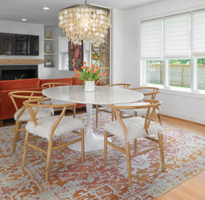 The den, dining room, kitchen, art studio and mudroom are located along the left side of the house. The dining room sits in between the den and kitchen, and the eye travels the full length of the space. Amy and Vincent worked together to create a subtle room divider between the three rooms. Amy found a three-panel screen at Green Front that Vincent reworked into two screens to use to visually divide the space. In the dining room, midcentury wooden chairs with white hair in hide cushions surround a white lacquered oval tulip table, a reproduction of the original Eero Saarinen tulip table created in the 1950s.
A capiz light fixture hangs above the table and an orange Oriental rug sits beneath it. An open-backed brass book shelf between the dining room and den holds a record player and records.
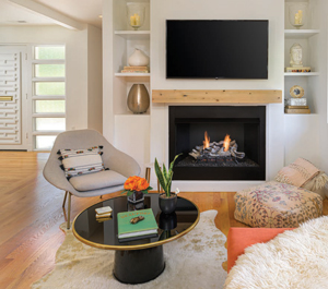
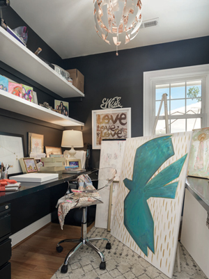 The small den features another sofa from Anthropologie, this time a terra cotta-colored sectional on top of a hide rug. The family TV hangs above the raw-wood floating mantel. Aqua Pools and Spas, Inc. installed gas logs in the fireplace for cooler weather. On either side of the mantel, built-in shelves house vases and Buddha heads. Between the two windows in the room hangs original artwork by Amy. Featuring brightly colored, cubic abstract flowers in shades of pink, orange and black, the artwork ties the room together as well as links it to the dining room palette. Conveniently, Amy has an art studio at the back of the house. Sliding the barn door aside, in this small space, she creates work of great style and whimsy.
When it came time to create a new kitchen and redo all of the bathroom cabinetry, Amy worked with Tracy Kearney, owner and designer at Cornerstone Cabinets and Design. Amy says that working with Tracy was “fabulous” because “she will research and find anything you need.” This was the case when Amy found a picture in a magazine of gold banding around a stove hood. Tracy sourced the brass tape for her and the results are stunning. The cabinets are flat panels in a white lacquer finish with gold, angular hardware. The countertops are white quartz and complement the white, large-tile backsplash that incorporates brass stripping instead of traditional grout. Piedmont Floors was brought in to help with all of the tiling done in the kitchen as well as the bathrooms. The kitchen features two ovens and two sinks as well as a specialty cabinet to house all of the appliances so they don’t clutter up the countertops. A large island provides lots of deep-drawer storage and seating on white leather stools for less formal meals.
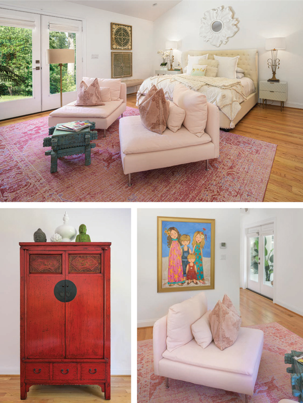
Directly opposite the kitchen, on the right side of the house, the Davises added a master suite. In the bedroom, they vaulted the ceilings and installed French doors leading out to the back yard. A king-sized bed with a tufted fabric headboard sits in between two white side tables with custom made vase lamps. A sitting area features two pale pink slipper chairs, and a red chinoiserie cabinet hides the television. On a trip to Atlanta, the Davises met artist Vikki Weigel and commissioned a family portrait of their children which now hangs outside the master closet and bath. Done in bright colors in a whimsical style, the children in the picture are not painted to likeness but instead are representational of each.
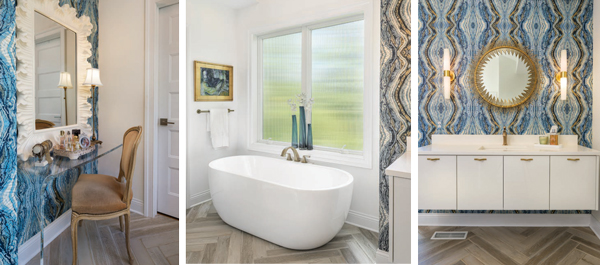
The master bath, as well as all of the other baths in the house, was a collaborative effort between Cornerstone Cabinets, Piedmont Floors, James T. Davis, and Amy’s creative mind. Design details include floating cabinets, modern sconces, gold hardware, bold geographic wallpaper and unique abstract art. Clean lines and high impact choices sum up these spaces.
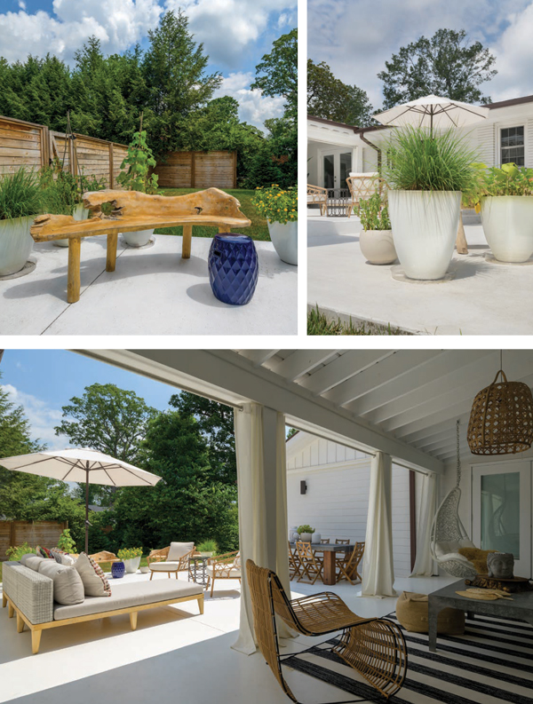
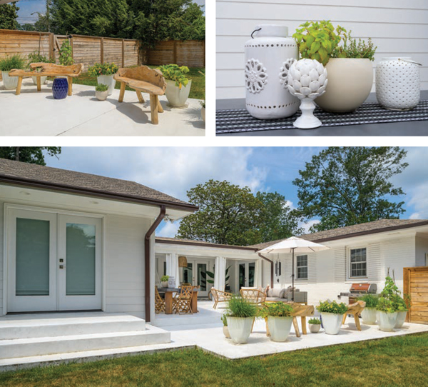
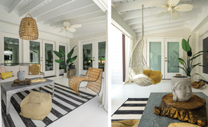 Not to be left out, the back courtyard is an area of beauty outside of the house. The Davises wanted the outdoor space to feel like an extension of the inside, and as a result, the patio is accessible from all sides of the house. A screened-in porch along the back wall of the house was taken out and it is place a three-level patio was erected. White planters dot the landscape and white outdoor curtains make the covered space feel like it could be in Malibu. A metal sofa with white cushions, a hanging chair and a painted concrete floor add to the beachy feel. For privacy, a horizontal slat fence was added along the left side of the house.
A house that was once the first of its kind in Lynchburg has found its way back to its roots, thanks to the loving restoration by the Davis family. This midcentury modern gem is beautiful, functional and extremely livable. It goes to show that great design will stand the test of time. ✦
1950’s Home, capiz light fixture, copper obelisks, French Doors, fretwork, glass blocks, greenstone fireplace, horizontal slat fence, linear concrete pavers, Midcentury Revival, sputnik sconces, traditional midcentury
