One Entry | Five Ways
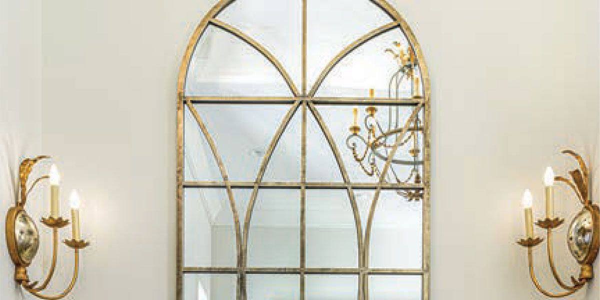
LOCAL DESIGNERS SHARE TIPS ON STYLING
Photography by Michael Patch
First impressions matter! The entry to your home—that first stop for visitors and the first thing you see when you return after a long day—is an opportunity to make guests feel welcome and put a smile on your own face. Here, take a few tips from five local designers on styling an entry console with flair.
MIXED METALS
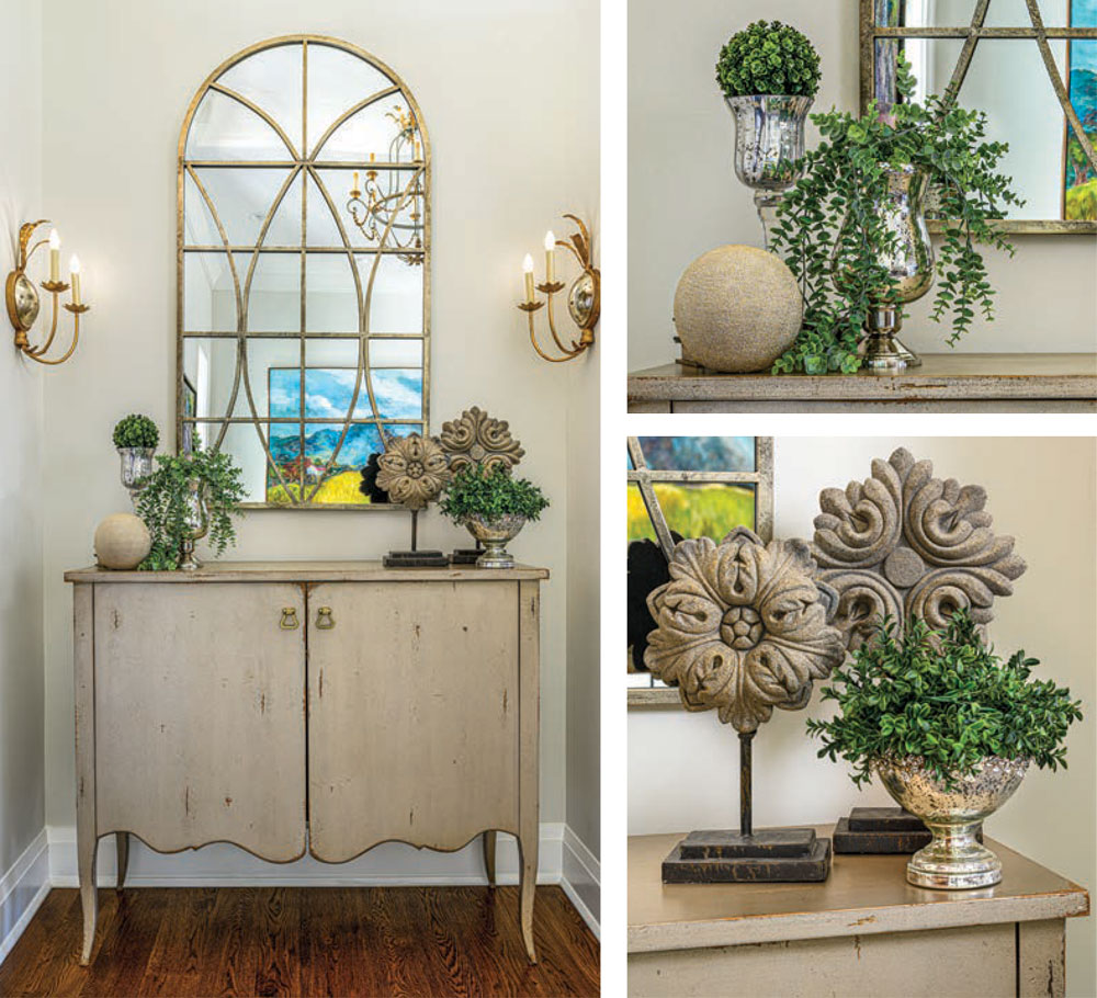
Kathy Potts of Decorating Den Interiors says that the existing gold and mirrored elements in the entry inspired this mixed-metal look. Decorative medallions have a gray stone-like look with gold luster, while a champagne-gold, orb provides another subtle metallic note. “Champagne finishes are great when mixing golds and silvers because they read somewhere in between,” Potts says. Mercury glass pedestal vases filled with faux boxwood greenery bring silver elements and color into the arrangement. “If you are going for a neutral color palette, plants help to bring color and life into the space in a natural way.”
No matter the color scheme, Potts says that on a long, narrow surface like this, arranging in groups of three on either end will bring visual interest and symmetry to your entryway. She suggests that each item in the set should vary in height; stacking decorative books can also add height when needed.
MAKE IT PERSONAL
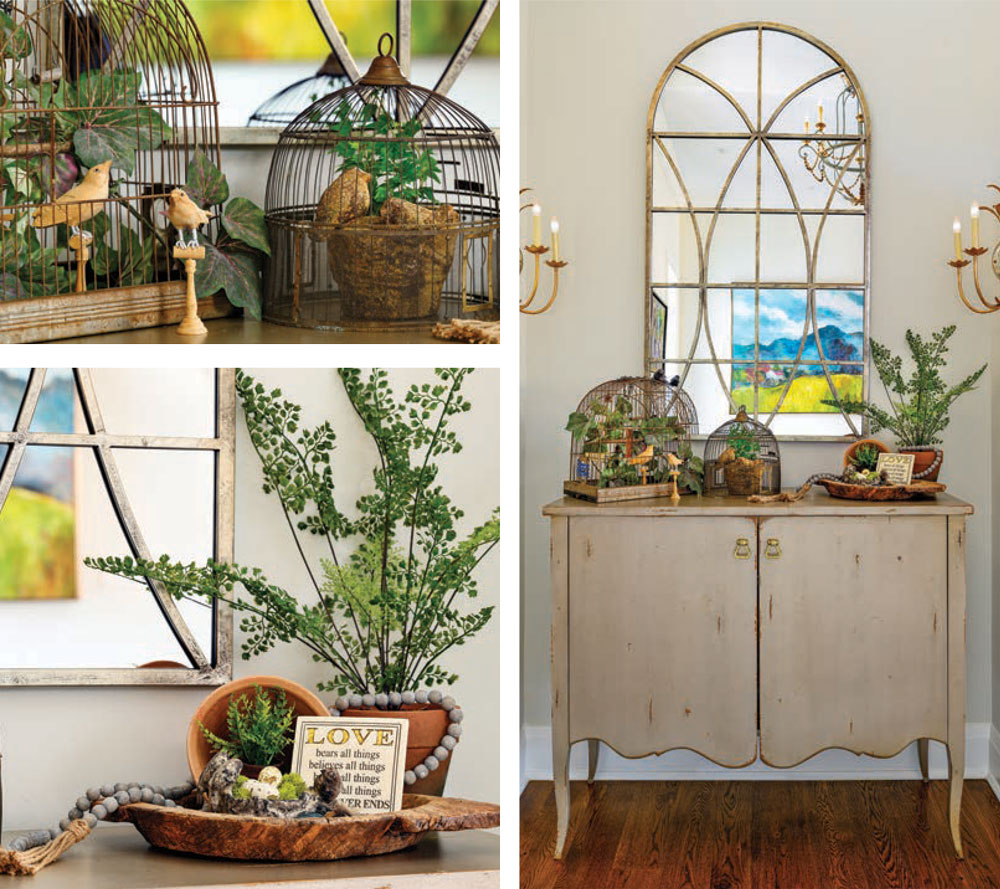
Jackie Barringer of Portobello Road says that while trends add freshness to decor, you should decorate with what you love to tell your story. Here, Barringer has combined some of her favorite things to create a vignette of seasonal delights. “I wanted to represent the birth and rebirth of spring, when it’s beginning to green up, but flowers have yet to bloom.” To create a display, Barringer says she starts with anchor pieces, then smaller items, then the “fluff” to complete it, using lots of textures. “I like curved lines better than hard lines. I also like to use something for movement within the display to draw interest throughout,” she says. Here, vintage birdcages with a mix of real and faux plants anchor the look, accented with smaller items in various textures including a terracotta pot, a bird’s nest with real quail eggs, wooden beads, wooden birds, and a stone plaque.
A DELICATE BALANCE
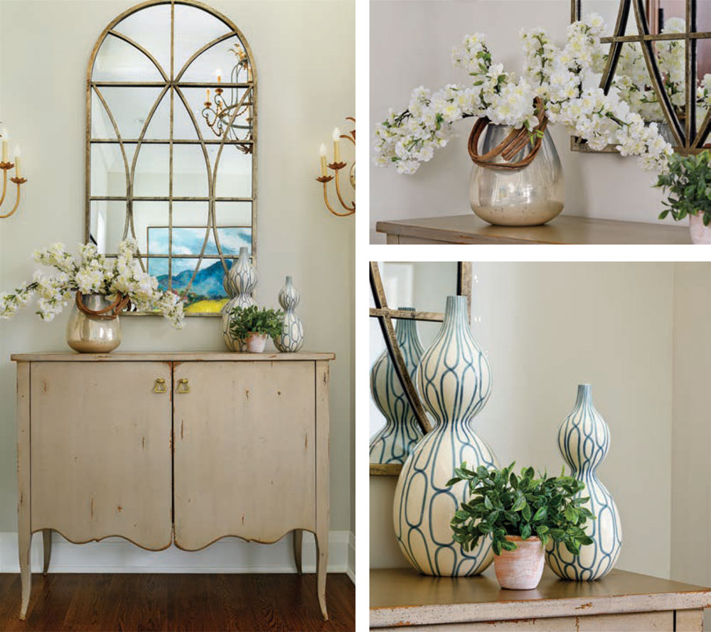
Lia Melder of Reid’s Fine Furnishings has embraced a soft, neutral color palette for a light and fresh welcome. A floral arrangement of Japanese cherry blossoms in a mercury glass vase on one side is balanced with a grouping on the other: two vases featuring a geometric design in varying heights and a small pot of greenery to add just a little more color and texture without competing with the flowers.
“When styling a hall cabinet/chest/table, for me the key is balance,” says Melder. “It doesn’t need to be identical on both sides, but you want to make sure when you look at it that one side doesn’t feel ‘heavier’ than the other.” She suggests experimenting with multiple items to achieve your desired look. “Don’t be afraid to try something new. You can always change it later!”
FRESH SIMPLICITY
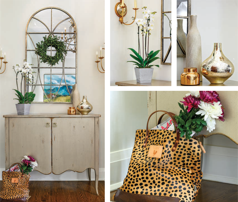
Sarah Girten of Sarah Girten Interior Design says that this vignette embraces the simplicity and freshness that come with spring using a combination of natural and decorative elements. “The layers of fresh elements—the boxwood wreath, fresh-cut flowers and a timeless orchid—all give the feeling that spring is in the air,” she says. A set of three neutral glass vases complements the spring theme, but could be used all season long. The animal-print bag is a fun addition, proving the point that even a workhorse that gets dropped by the door can—and should—become part of the decor.
CONTRASTING TONES AND TEXTURES
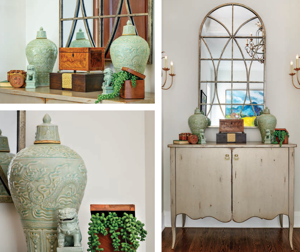
Troy Deacon of High Cotton Fine Home Furnishings and Gifts mixes colors, textures and materials for an interesting display of treasures. Celadon ginger jars and foo dogs anchor the space with visual weight and provide symmetry, while stacked boxes in the center provide height to the display. “Using decorative boxes on an entry table is both beautiful and functional,” says Deacon. “You could tuck away your keys or other grab-and-go items to keep the table clutter-free.” Additionally, the cool green and warm woods together offer a nice contrast in tones. Fresh greenery peeking out of another decorative box adds softness and an element of surprise, while a cloth-bound book adds another note of texture and interest. ✦
anchor pieces, Champagne finishes, Decorative medallions, display, entry, golds, mirrored elements, MIXED METALS, natural and decorative elements, neutral color palette, silvers, textures


