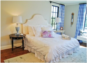
That Elusive Paint Color: Designers Rave over Faves

We all know that paint is one of the quickest, easiest and most economical ways to transform our interior spaces. But the choices, oh the choices! Picking a color from the endless array of chips and bulky fan decks can send even the most decisive homeowner into a swivet. Too light? Too dark? Too yellow or pink? Here, some of our area’s designers and other interior specialists generously share some of their favorite colors and ways to use them to freshen up our homes. HOME offers them to you as a starting point for your next interior paint project. Enjoy!
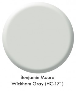 “I love Benjamin Moore Wickham Gray (HC-171) on walls and trim! It’s a fantastic cool neutral that updates any space. I’ve used it in two recent design house projects (Charlottesville Design House, and The Preserve at Oakwood’s Dream Team Design House) and everyone loves it.”
Moyanne Harding
Interiors By Moyanne
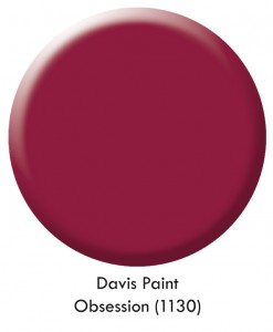 “The most-recently used favorite color for me is a Davis Paint Color 1130 called Obsession. It is a cranberry color that instantly brightened up a client’s dreary guest room. This should be used by color lovers, because it’s bold and makes a dramatic statement. It was a beautiful accent color that coordinated perfectly with Thibaut wallpaper and crisp white bedding.”
Haley Pavao
James T. Davis
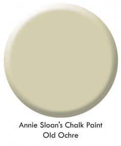 I love Annie Sloan’s Chalk Paint. Its rich, thick consistency spreads beautifully and dries to a velvety matte finish in just a few hours. I love the color ‘Old Ochre’ for furniture. It’s not too white and not too yellow. Top with Annie’s wax and the finish is tough as nails.”
Heather Kinder
SPACES by “a little french”
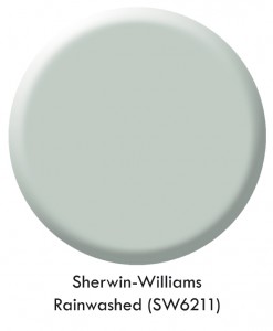 In the past year, one of my favorite colors that I have used is Sherwin-Williams 6211, called Rainwashed. I like it because it works well with both a green or blue palette. I have used it in bedrooms, baths, and living areas.”
Cynde Buckles
Lynchburg Design Company
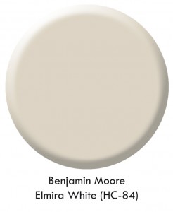 One of my favorite paint colors (and I have many!) is Benjamin Moore Elmira White (HC-84). A fabulous neutral with a bit of gray looks gorgeous with white woodwork. It works well with contemporary, traditional and transitional themes. Strong colors in ikats, geometrics and large floral patterns, as well as dark wood furniture, and gold and silver metallics, are beautiful with Elmira White as a backdrop. Neutral never looked so good!”
Linda Edwards, C.I.D.
Decorating Den Interiors
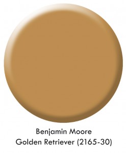 My favorite color is ‘peanut butter,’ a rich but comfortable color. Benjamin Moore Golden Retriever (2165-30) is a good example of this color. It makes a great foil for porcelains—especially Imari, blue and white Canton, and armorial porcelain. It’s a fabulous foil for oriental rugs and black and white etchings, providing just enough drama. A ‘dove white’ trim complements it beautifully.”
Mary Brockman
Enchanted
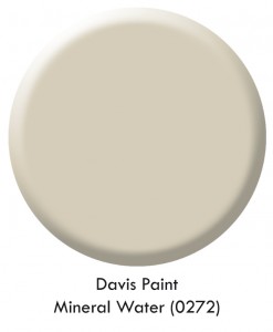 My favorite color is Davis Paint Color 0272 called Mineral Water. This is a good neutral that doesn’t pick up yellow or pink, and lots of accent colors can be paired with it. It is a great neutral to use throughout new construction or for homes going on the market. Homeowners can depend on this color knowing that their furnishings will blend perfectly with it.”
Donna Sisk
James T. Davis
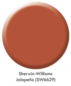 My favorite color is Sherwin-Williams 6629 called Jalapeño. This color is a warm orange and is the number-one decorating color across the board for not only windows, walls, and furniture, but in the clothing end as well. It works well with the warm colors that folks are using now in furniture, giving rooms a punch of brightness. Many would be afraid that this color is too dark or overwhelming for a room; however, if you love a light and airy look, you can pair this with a lightweight linen in white or ivory on your window and accessories to give the room more brightness.”
Cindy Greer
Curtains, Blinds and Bath
